Showing posts with label vintage. Show all posts

December 31, 2013

orla kiely s/s 2014.


The new spring/summer 2014 show from London fashion house Orla Kiely is definitely getting me.  It's one part Suzy Bishop from Moonrise Kingdom, one part Anna Karina, and one part outdoor sock hop.  I always appreciate the retro-inspired, feminine details that she puts into all her pieces along with her signature patterns.  Clothing aside, I also love the styling of the set which is reminiscent of a natural history museum diorama.  Looks like it's time to buy a beret and some pointelle knee socks for my next safari.  See more from Orla Kiely here.

December 4, 2013

paul x johnson.


London-based artist Paul X. Johnson definitely has a way with the ladies - painting them, that is.  He uses a beautiful muted color palette to set the tone for his moody raven-haired vamps, who always seem to have something on their mind. Whatever that may be, they look good doing it, and his restrained technique with the brush really brings them to life.  I would kill to have a portrait done in his style! After I get my eyebrows done of course.  See more from Paul here.

July 2, 2012

a good day for a painting.

i have been keeping my eye out for a good vintage oil portrait for some time now, but you'd be surprised how hard it is to find the right one.  all the properly done, good-looking portraits are too expensive for my budget, and all the ones within my budget tend to have peculiar expressions or slight deformities of some kind (see here).  however i think i finally found my girl!  not only was she affordable (under $50!), but her fantastic 50s retro character, loose brushstrokes, and oversized bang curl won me over.  now she just needs a name ... betty sue?

March 19, 2012

making eyes.


anyone that knows me knows i'm a huge fan of a cateye, and i'm always collecting images to see how i can jazz them up.  but that top photo might be my favorite cateye yet - perfectly executed with just a hit of unexpected sparkle in the right places.  definitely trying that for the next big night out! 

February 1, 2012

a good day for a tintype.

while i generally avoid posting photos of myself online, i have to make a brief exception today thanks to the amazing san francisco studio, photobooth.  i had a tintype done (yes, like from the 1800s) and was so pleased that i wanted to share.  you only get one shot and have to stay painfully still, but the detail is exquisite, and getting to leave with an actual object in hand (they last 200 years!) is a happy antithesis to the modern digital experience.  a fairly recent addition to my hood, photobooth is a gallery, shop, and studio in one, and you can either sit down and have a portrait done or peruse their drool-worthy selection of old school cameras.  now i want one every year for the rest of time!  go here to find out more.

January 31, 2012

in love ... with louise despont.


i'm in love with louise despont, a brooklyn-based illustrator who creates precision-perfect drawings done on gridded parchment paper.  while she originally began working on paper found in vintage ledger books from india, her work has grown in scale and scope since her early pieces, with her language of line, shape and pattern expanding in proportion to the size of her canvas.  i love how the content of her more recent works reflects the shift in size, with the newer pieces nodding to large pieces such as traditional rugs, kilims, and quilts. the compositions have a somewhat religious and psychedelic quality to them, and her obsession with intricately designing within a grid is reminiscent of artist eugene andolsek, who i posted on earlier.  keep the tradition alive louise.  learn more about her here.

September 24, 2011

vintage camp invitations!

i am so stoked to finally share some pictures of another project i worked on last month - designing the wedding invitations for my good friends oliver and naya!  of course it doesn't hurt to work on a project for someone you already know, especially when they are planning an epic weekend-long wedding party set at a vintage summer camp, so there was no way this wasn't going to be fun.  naya and i have very similar color inclinations to begin with, a good starting point, but the rest of the inspiration really came from the camp itself - the rustic cabins are tipped in bright teal paint, and the archery targets pop out of the natural setting with their yellow, red and blue concentric circles.  vintage camp ephemera and signage also helped define the mood and typography choices. 


aside from the main invitation, everything was digitally printed, cut, and folded in house by me! the invite was printed on maple veneer by the lovely folks at cards of wood, located in western michigan.  the veneer is flexible, but sturdy enough to survive the journey that invites have to make through the mail, and the wood was a perfect material for the theme. the maple was nice because it had a distinct, noticeable grain that made each piece unique.


my favorite parts to work on were the fold-out map and wedding weekend checklist.  since this is a days-long event with loads of activities sprinkled throughout the gorgeous camp property, i thought it would be most fun to create a map and legend that guests could bring with them on their stay.  the layout was inspired by vintage travel postcards, though i took a more modern approach with the illustration itself.  for those staying at the camp, i created a small checklist with hand-drawn illustrations of the items needed to survive the weekend.  my favorite?  outdoor finery.  my feathery fascinator is lined up and ready to go.
last but not least, the icing on the invitation cake was a custom return address stamp, designed by me and made by los angeles based company paperwink (their made-to-order stamps are great as well!).  so now that the invites are out and there's less than a month to go, all i have left to do is sit back and look forward to the big event!  that, and practice my archery stance.  in heels.

September 13, 2011

vintage lust.


today fab.com featured some gorgeous refurbished vintage typewriters by kasbah mod and it took everything in my power not to snatch one up.  even a simple note or letter feels more special as you click clack away on one of these beautiful machines, and they are so damned good looking that i'd feel obliged to pin up my hair and put on a pencil skirt if i was in the same room with one.  granted, most of them are sold out by now, but a girl can dream anyway, one carriage return at a time.

August 16, 2011

seeing spots.


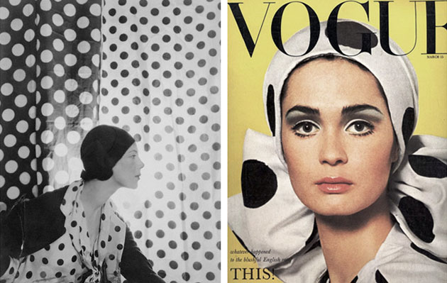
pattie boyd and celia hammond 1965 <><><> brigitte bardot <><><> emma stone in marc jacobs <><><> bernard voita <><><> life magazine <><><> elle fanning <><><> tilly losch <><><> vogue 1965 <><><> hansel from basel tote <><><> unknown